Color in 2026 isn’t whispering anymore—it’s speaking clearly, confidently, and with emotion. The color palette for 2026 is a fascinating mix of softness and boldness, calm and charisma. At the center stands Cloud Dancer, a gentle neutral that feels like a deep breath. Orbiting around it are vibrant shades of orange, blue, purple, green, and pink, each bringing its own personality to the table.
Think of this palette as a perfectly curated dinner party: elegant, expressive, and impossible to ignore.
Why Color Trends Matter More Than Ever in 2026
The Emotional Power of Color
Colors aren’t just visual choices—they’re emotional triggers. In 2026, people are choosing colors the same way they choose music: to match their mood, elevate their energy, or calm their nerves. After years of uncertainty, there’s a collective desire for both comfort and self-expression. This must be the reason why Pantone has chosen cloud dancer as the color of this year.
Meet Cloud Dancer – The Anchor Neutral of 2026
What Is Cloud Dancer?
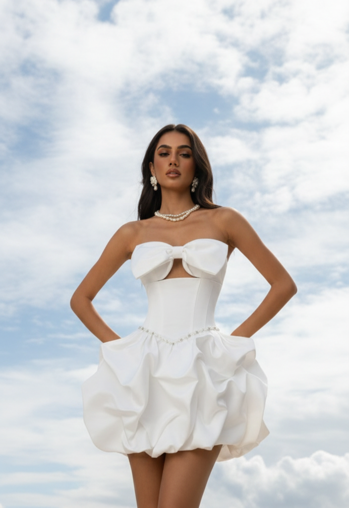
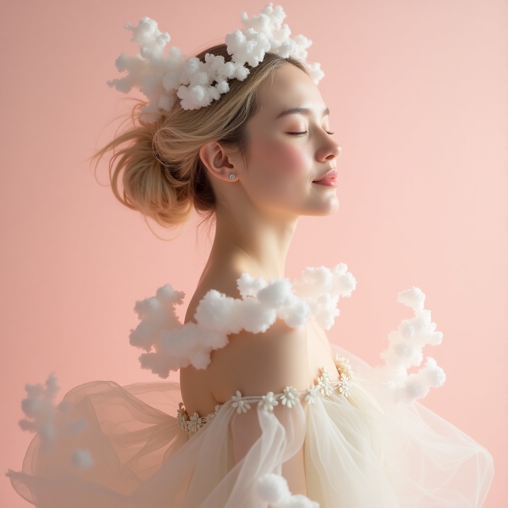
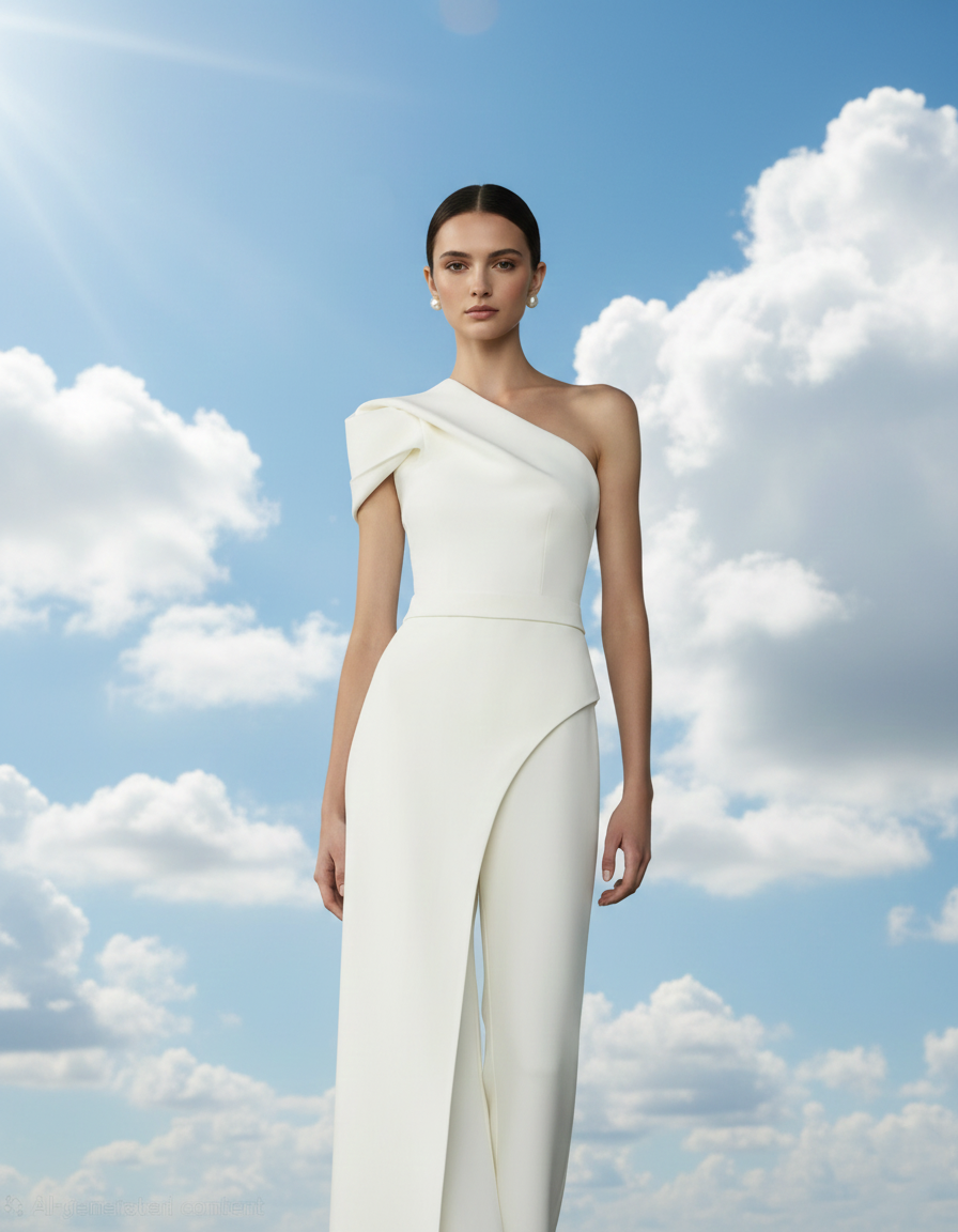
This is not your typical white. It’s a soft, airy off-white with a hint of warmth—like sunlight filtered through sheer curtains. It feels clean without being cold, modern without being sterile.
Pure white can feel harsh. Cloud Dancer softens spaces, outfits, and designs while still keeping everything elevated and fresh.
In fashion, Cloud Dancer works as a luxurious base. Think tailored trousers, silk blouses, and minimalist dresses. It lets vibrant colors shine without competing with them
On walls, Cloud Dancer creates a calm backdrop that makes bold furniture and accents pop. It’s the neutral designers didn’t know they were missing.
Vibrant Colors Defining 2026
The Rise of Expressive Color
2026 is not afraid of color. After years of muted palettes, vibrant shades are back—but smarter, richer, and more intentional.
Balancing Soft Neutrals with Bold Shades
Cloud Dancer acts like the pause between notes in music. It gives space for orange, blue, green, and pink to play without overwhelming the senses.
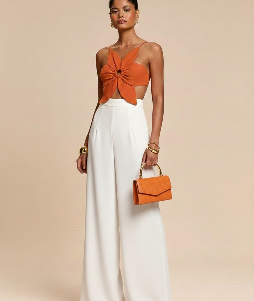
Orange – The Punch Energy
Why Orange Is Back
It represents warmth, creativity, and forward motion. In 2026, it symbolizes optimism without naivety—a grounded joy.
Best Orange Pairings for 2026
Pair orange with Cloud Dancer for a clean look or with teal for a bold, artistic contrast. It’s electric when used as an accent.
Blue Tones – Lagoon and Royal
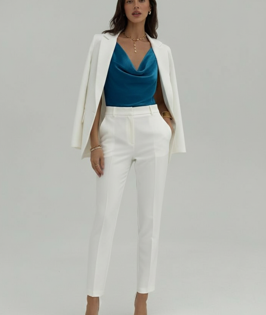
Lagoon Blue: Calm Meets Escape
It feels like clear water under a summer sky. It’s soothing, refreshing, and perfect for wellness-focused spaces and relaxed fashion.
Royal Blue: Power and Precision
It brings authority and confidence. It’s sharp, elegant, and ideal for statement pieces or branding that wants to feel premium.
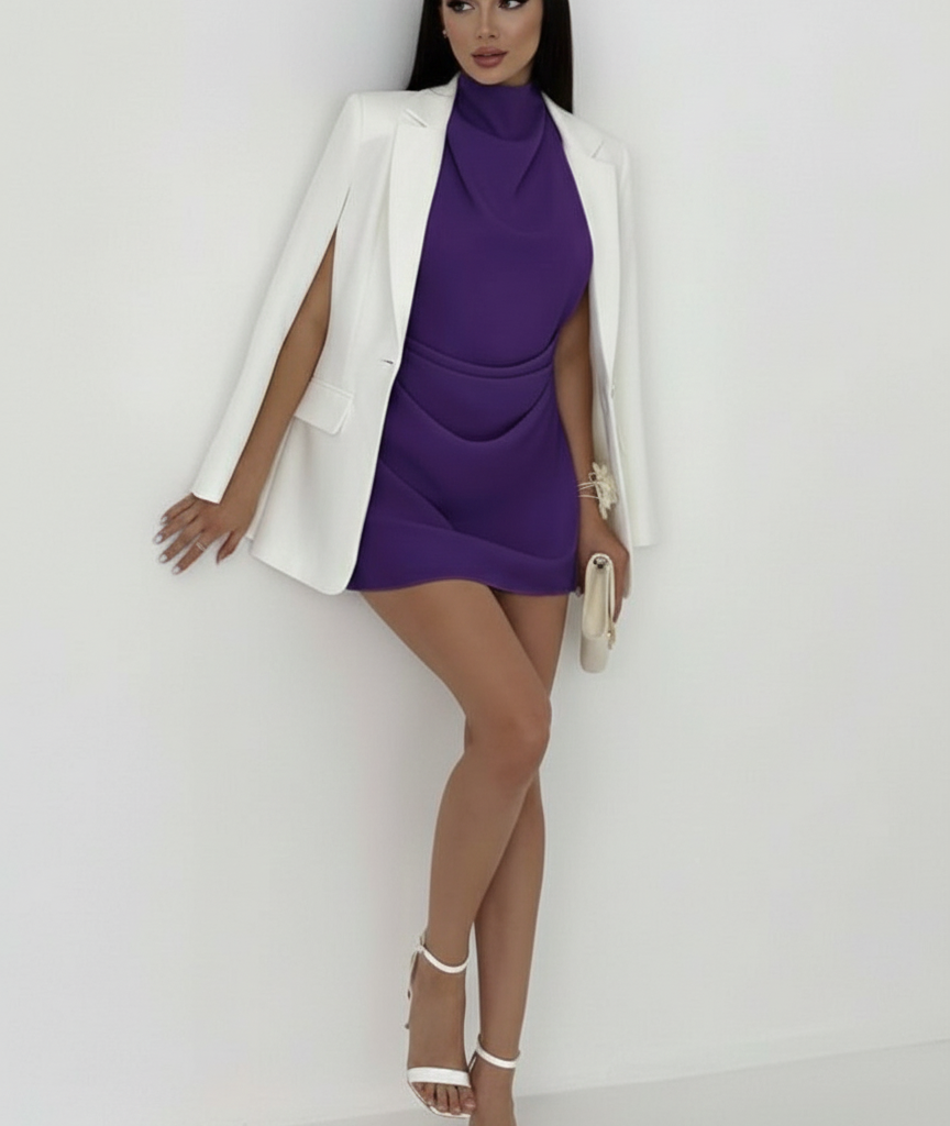
Purple – From Mysticism to Modern Glam
It has evolved from mystical and dramatic to sleek and modern. In 2026, it feels intentional, bold, and quietly luxurious.
Purple as a Statement Color
Used sparingly, purple elevates any palette. Think accessories, accent walls, or standout garments.
Green Takes Center Stage
Teal: Depth and Sophistication
It blends blue’s calm with green’s grounding effect. It feels intelligent, elegant, and deeply modern.
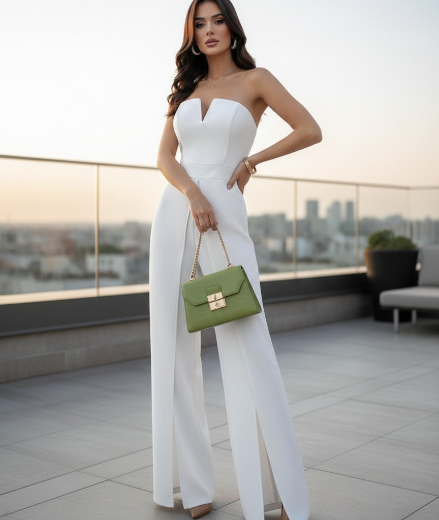
Primrose: Fresh and Optimistic
It is light, cheerful, and full of life. It brings freshness without screaming for attention.
Pistachio: Playful Yet Refined
It is the unexpected star—soft, creamy, and surprisingly versatile.
Pink’s Dual Personality
Candy Pink: Bold and Youthful
It is playful, confident, and unapologetic. It’s joy in color form.
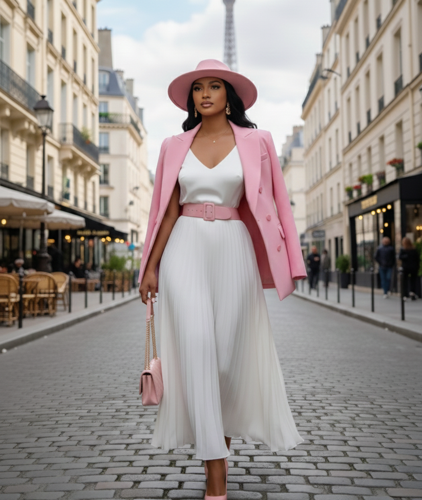
Pale Pink: Soft Power
It brings warmth and elegance. It’s subtle but impactful—perfect for minimalist lovers.
How to Combine the 2026 Color Palette
Soft and Harmonious Palettes
Cloud Dancer with pale pink, pistachio, or lagoon blue creates calm, luxurious harmony.
High-Contrast Combinations
Royal blue & candy pink. Orange & teal. Purple & pale pink. Primrose green & royal blue. These combos feel bold, creative, and fashion-forward.
Mistakes to Avoid
Avoid using too many vibrant colors at once. Let Cloud Dancer breathe between them.
Runway Predictions
Expect layered neutrals with bold accents, monochrome statements, and unexpected color blocking.
Everyday Wear vs Statement Pieces
Use vibrant colors in accessories for daily wear and go bold with full-color looks for impact moments.
Visit axdei.com for more insights about fashion and lifestyle.


Comments are closed